Find Out If Your Neighborhood Is Getting Richer Or Poorer
Is your Census tract getting richer or poorer? Well great news readers, I found just the mapping tool to tell you.
The University of Minnesota Law School’s Institute on Metropolitan Opportunity has a nifty interactive map that shows areas that are improving or declining from 2000 – 2016. The map divides the country by Census tracts instead of zip codes.
As they explain it:
Tracts are categorized based on changes within low-income and non-low-income population between 2000 and 2016. Low-income individuals are defined as those below 200 percent of the federal poverty line.
They use terms that can be confusing such as “displacement tracts” and “concentration tracts”. As they describe it:
Displacement tracts are those showing strong economic expansion and a net decline in low-income population. Concentration tracts are those showing strong economic decline and a net increase in low-income population.
On the map displacement tracts are blue-ish tint (ie, good) and concentration tracts are reddish tint (ie, bad).
Along with the map there is a lengthy report if you want to really geek-out on the data. A few of the interesting findings to me were:
- Rapid neighborhood change – both economic growth and decline – is much more common in central cities than in suburban communities. Among the top 50 largest metropolitan areas, an average of 44 percent of central city residents live in a neighborhood experiencing strong change, compared to 25 percent of suburban residents.
- Poverty concentration is overwhelmingly a suburban problem. In the top 50 metros alone, about 24.4 million Americans live in a census tract that has undergone poverty concentration. This represents 67 percent of all people experiencing poverty concentration in those regions.
- As of 2016, there was no metropolitan region in the nation where a low-income person was more likely to live in an economically expanding neighborhood than an economically declining neighborhood.
Interesting Examples
As in most things related to money, the Washington D.C. area is unique. Not only does it have the top 5 counties with the highest household incomes in America, it has also gentrified more than most cities in the past 20 years. The report notes:
Among central cities, Washington, D.C. has the most severe low-income displacement, with over 35 percent of its low-income population living in economically expanding areas and the low-income population of those areas declining by over 25 percent since 2000.
Here’s what it looks like:
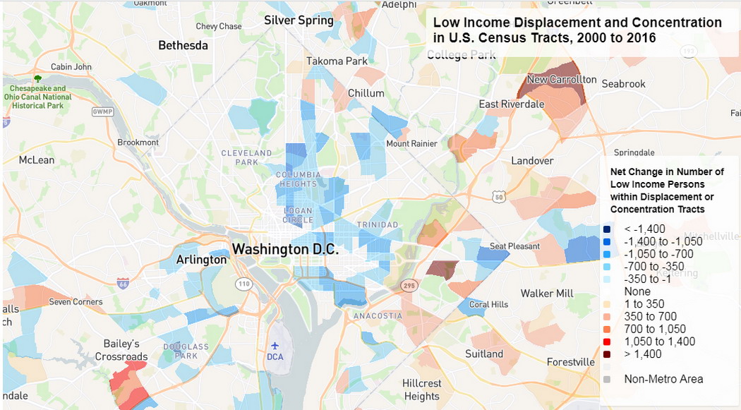
That’s a lot of blue. And some of those areas gentrified in literally 2 or 3 years. The changes I’ve witnessed to the city over the past 20 years are unbelievable.
To see the opposite extreme, there’s Detroit.
Holy smokes.
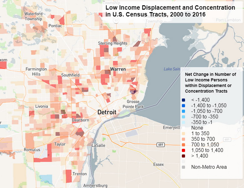
The Washington Post did a great article on the demise of Detroit. And Forbes takes a slightly different look since Detroit has been unable to recover like other comparable cities. They conclude Detroit’s struggles are about its inability to attract capital, business and economic growth. Either way the data are stark as the map shows.
Other cities in the mapping tool show interesting geographic patterns. During the period of the report Amazon moved it’s headquarters to Seattle and it became a much more expensive city.
Here’s what Seattle looks like:
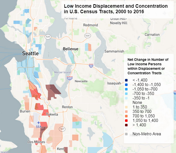
It appears that as the city gentrified the areas south of the city became much poorer. Perhaps this is where some of the former urban poor relocated to or perhaps there are other factors at play.
Lastly take a look at North Dakota if you have a second. Yep, that’s from the natural gas boom that happened during this time period. It went ‘kinda’ bust in 2015. In a previous post I highlighted a super-cool animated map showing the changes to unemployment over time and watching North Dakota change was amazing.
Some Faults
As I’m sure some of you have already thought, “richer or poorer” is not necessarily best defined by the analysis in this map. Simple median income or net worth might be better.
But notice the University of Minnesota folks never used the terms richer or poorer, I did. I realized folks won’t open a post that asks “Is your neighborhood a displacement tract or a concentration tract?”, so I took some liberties. 🙂
Additionally, they do not take the cost of living of a Census Tract into consideration. However, the Federal Poverty definition doesn’t either, and that’s what they’re using as a benchmark. The Feds only separate out Alaska and Hawaii geographically and keep the lower 48 states the same.
Geoarbitrage
Geoarbitrage is a viable and popular tool for those seeking financial independence. This simple mapping tool can help you find areas of the country that are getting richer or poorer.
I’ve done lots of other geographic-based posts showing various aspects of money and finance from a location perspective. Be sure to check out my Geoarbitrage Resources Page that has tons of great tools to help you find your perfect location.
I hope you find this resource handy and I will continue to expose valuable tools that can help when deciding on a geoarbitrage strategy.
Your turn readers – is your home Census Tract a shade of blue or red, or is it unchanged? Comment below!














detroit probably fits well with resurgent rust belt cities like pittsbugh and buffalo as a model. my neighborhood has gotten significantly better since 2000 but part of that might be luck. other parts of the b-lo aren’t as fortunate. i know for a fact that some places just can’t get out of their own way like niagara falls, ny and rochester. i’ve seen money spent on projects that didn’t have much overall impact so there’s that too.
I haven’t been to Buffalo in many years but I remember lots of rundown areas. Of course it was winter too and that made it seem even more rundown
This is a very cool map. Portland is similar to Seattle. The central city area improved and the lower income household got pushed out a bit. There are still plenty of homeless people in the core area, though.
I remember Portland being pretty rundown but I haven’t been since 2002
The downtown core is much nicer now. Visitors and suburbanites really dislike the homeless people, though. But it’s the same as any big cities these days, from what I hear. Homelessness is visible everywhere now.
Wealth inequality is damaging much of urban United States and Canada, it is very sad to see the liveability of the everyday people threatened. Hopefully tools like this can empower government to make change and help people, the capitalism of the free market does need some checks and balances.
Where I grew up at least in Baltimore the local government can’t get out of their own way and just make the problem worse. Baltimore’s mayor just had to resign 3 weeks ago amid a financial scandal, the second time it’s happened out of the last 3 mayors. They keep electing corrupt and incompetent criminals, they keep getting the same results.
Crazy stuff going on and we need a new generation of people in positions of power that truly give of themselves for the good of society and not for their own benefit
We keep electing similarly corrupt and incompetent criminals in Philly. Corruption is part of the culture here. At least the local news sources are finally reporting some of the corruption instead of essentially being complicit by refusing to cover it.
My area is trending green. Not surprising they keep building new homes near me and they all cost 3-4 x what I paid for my own a few years ago.
Good for your net worth, bad for your taxes 🙂
Pshh you left my part of the Seattle area off this map! Also, did you know I did a GIS internship with the census through the state in college? They use their own off brand software (or at least they used to) and it was TERRIBLE to work with.
Cool! Man from Park ranger to Census, you’ve been at some awesome places. I cut my teeth some what in GIS using TIGER files from Census since they’ve always been free and available. They still have great data but I don’t know about any of their proprietary software.
Yeah, it’s been long enough I don’t really remember the details.
You always find these great data sources. I am a data geek, and I love looking at this stuff. I really just want to say thanks for posting.
The small town I grew up in has issues for reasons that are causing the town to break in two. The folks in one village in the small town have a different philosophy than the rest of the town, and it’s causing the change. I would be interesting to see the data, if they update it, after the village becomes a new town next year. Do you know if they will update it?
Glad you like these, data is the best! I do not know if they update but you should look into the full report (link is in the post) and see if there’s an email address in there to contact. Sounds interesting as to what will happen!
Nifty find, David! All I’ve done to this point is observe the crazy number of tear-down and rebuild homes in our hood. We’re observing an incredible decay of original, modest homes with strong foundations being razed in order to bring in monster 3,000 SF behemoths that shadow over ranch / bungalows next door. Throw in some Volvos and Audis, and you get the picture.
It’s happening here all over. On my Sunday morning long ride I probably pass 20 or 30 tear-downs. And they’re not being replaced by 3000sq footers, it’s more like 4500sq footers. Ridiculous. Yet these people say “the middle class isn’t getting ahead…”
Really interesting stuff as always Dave! I think you hit the nail on the head with Seattle. Rising rents have really pushed out low-ish income folks. Most people can’t afford to live downtown anymore!
It’s changed since I first went, thanks Amazon
Another great map! This map confirms two things: 1) I’m glad Amazon didn’t choose Philly for its second location, and 2) all the complaints I’ve heard about gentrification and the newly impoverished areas are true. I witnessed much of the growth in my area and saw some of the decline in other areas, but this map illustrates exactly where those pockets are. Interesting!
The gentrification battles in DC are real and have been getting nasty. Identity politics plays a big role, no surprise there. But it’s also about affordable housing, for all people.
I think it’s about the same in Philly.
Really interesting interactive map, thanks for finding this resource!
My area of Los Angeles is overwhelmingly blue, with some reddish patches scattered around. But even Compton is mostly blue, which I found surprising. I guess the whole area has been lifted and gentrified over the last decade and a half.
Good stuff.
— TDD
Glad you liked it and also glad to hear about more blue out there. I was in L.A. last Aug and the amount of homeless surprised me. I knew they had a problem but it was bigger than I expected.
You’re right about the homelessness. It’s increased 75% in LA recently, according to one source I saw. Income inequality, homelessness, and gentrification, all in one big steaming mess!
A very similar thing has happened in San Francisco, but I think on an even more extreme level.
— TDD
This is such a cool find!
One anecdote – I used to live in one of the bluest areas in Manhattan. Our rent went up 3-4% every year. We couldn’t negotiate because our landlord knew he could find another tenant in days (and he did when we moved). I moved to a less blue area in Brooklyn, and our rent has been flat.
I’d imagine this would be good discussion fodder for the buy vs rent debate…
Indeed, the buy vs rent thing is hyper-local if you ask me and resources like this can surely help. More data is good.